Food with a story to tell
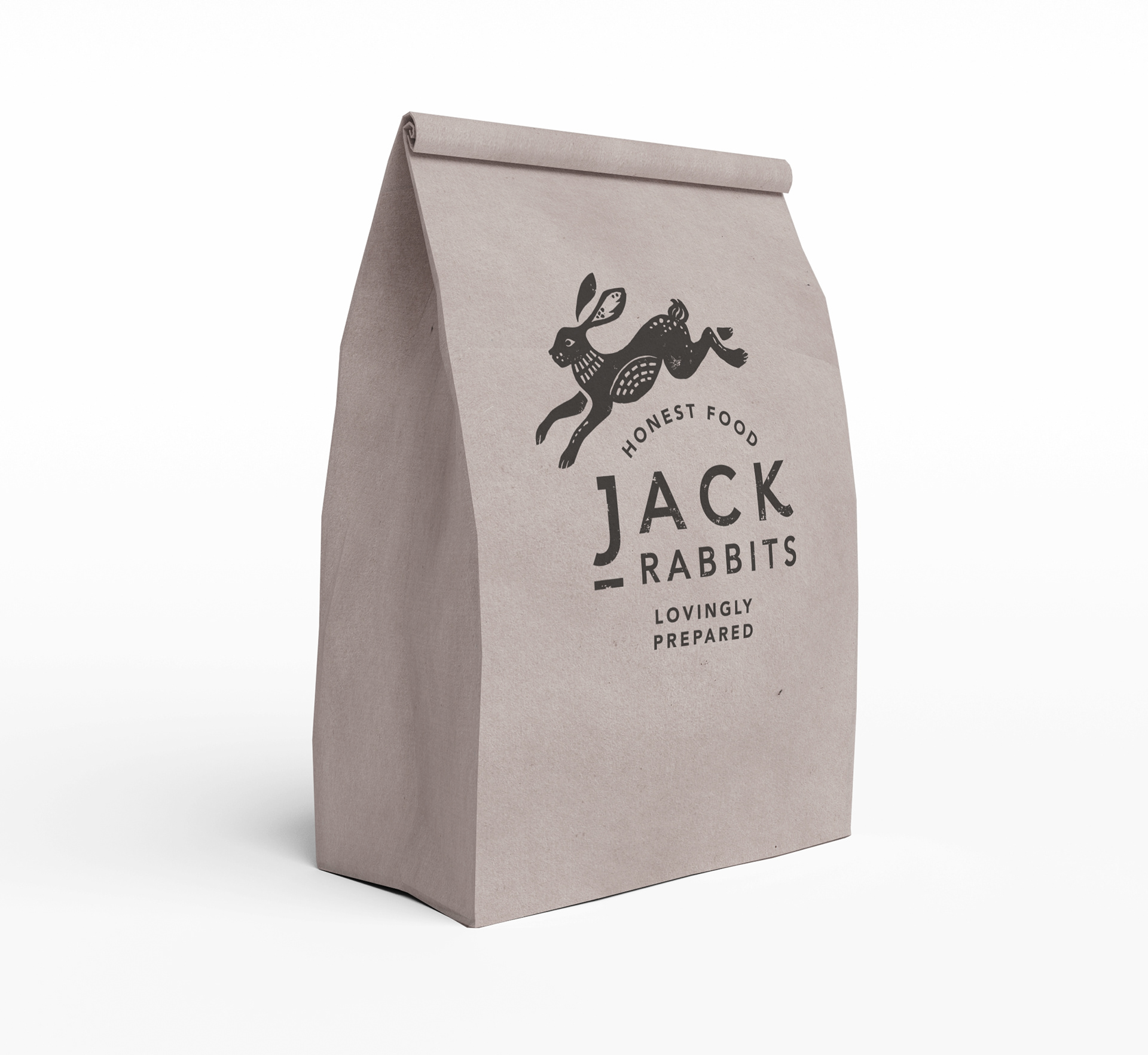
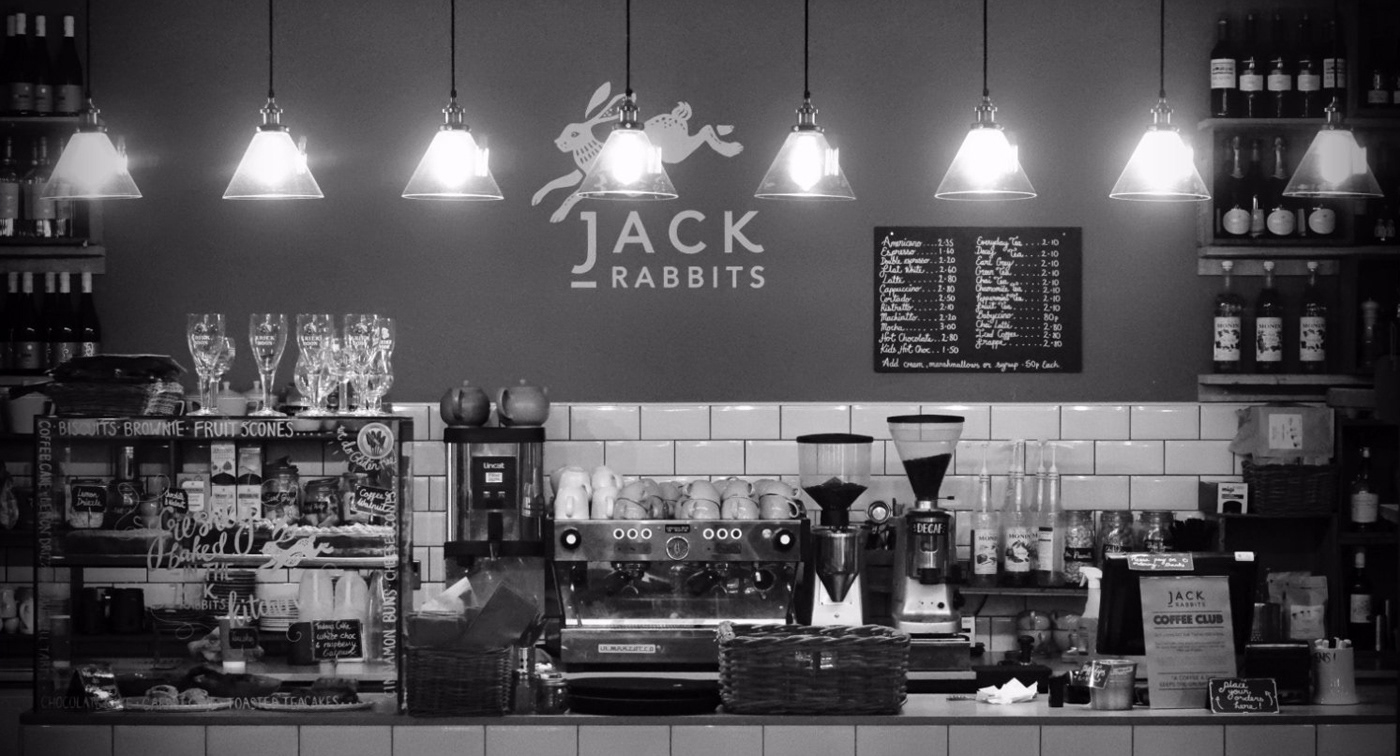
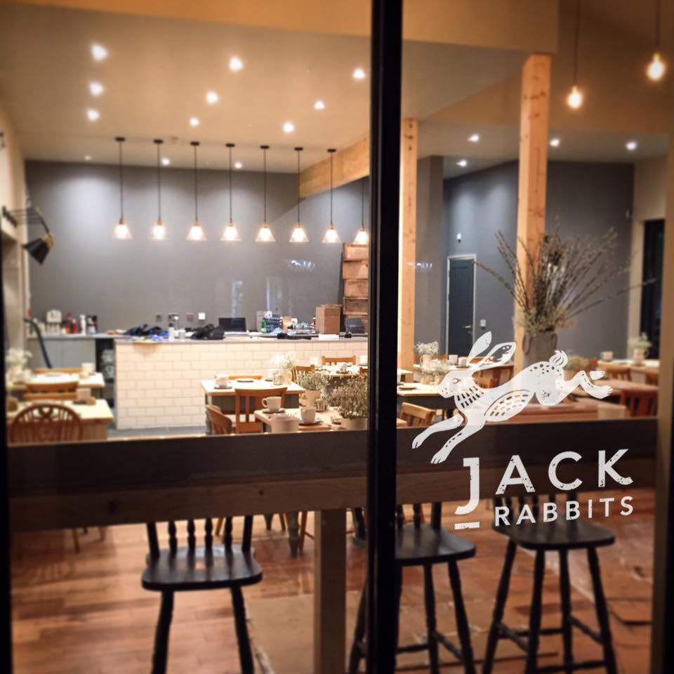
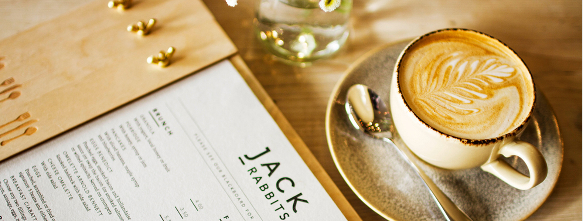
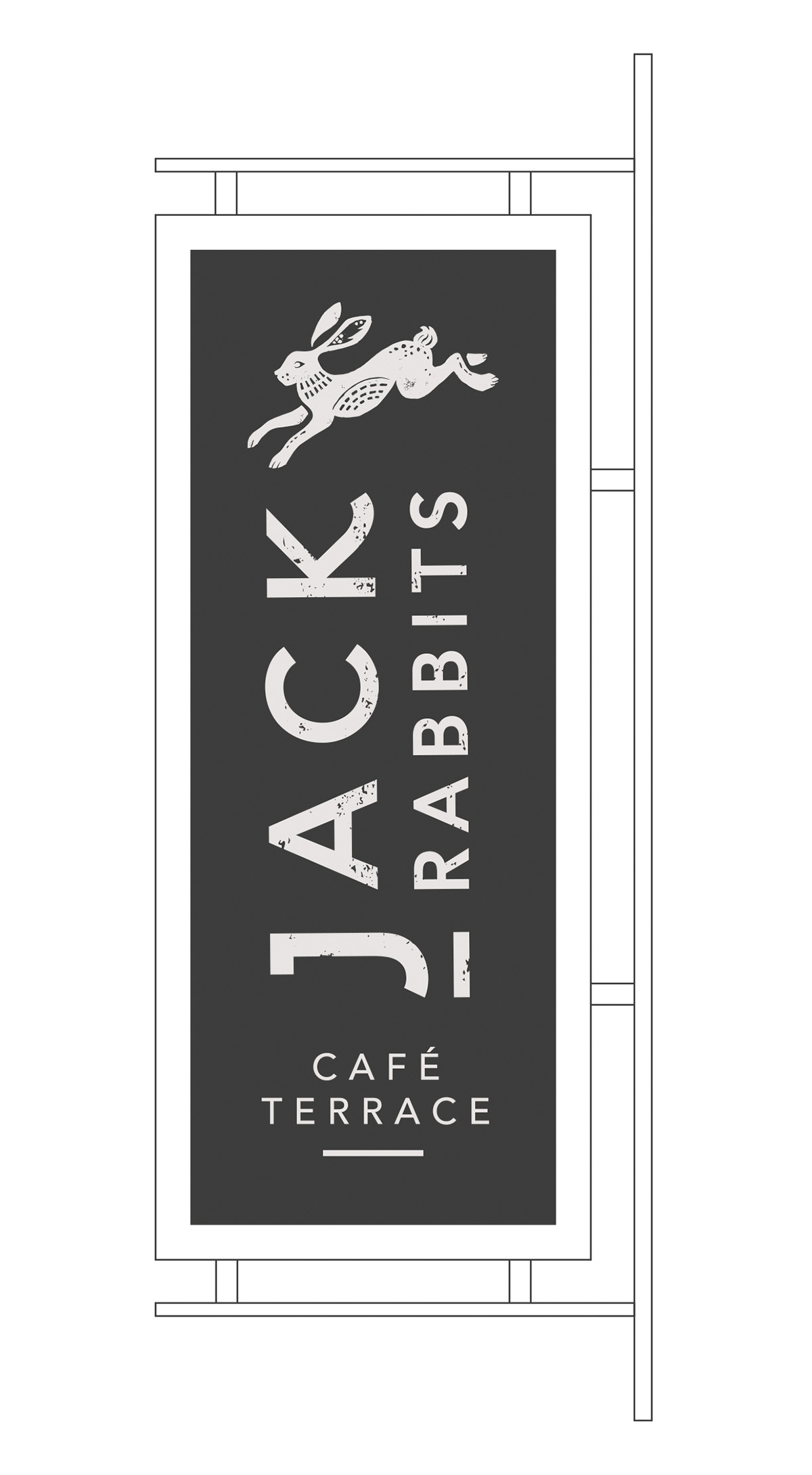
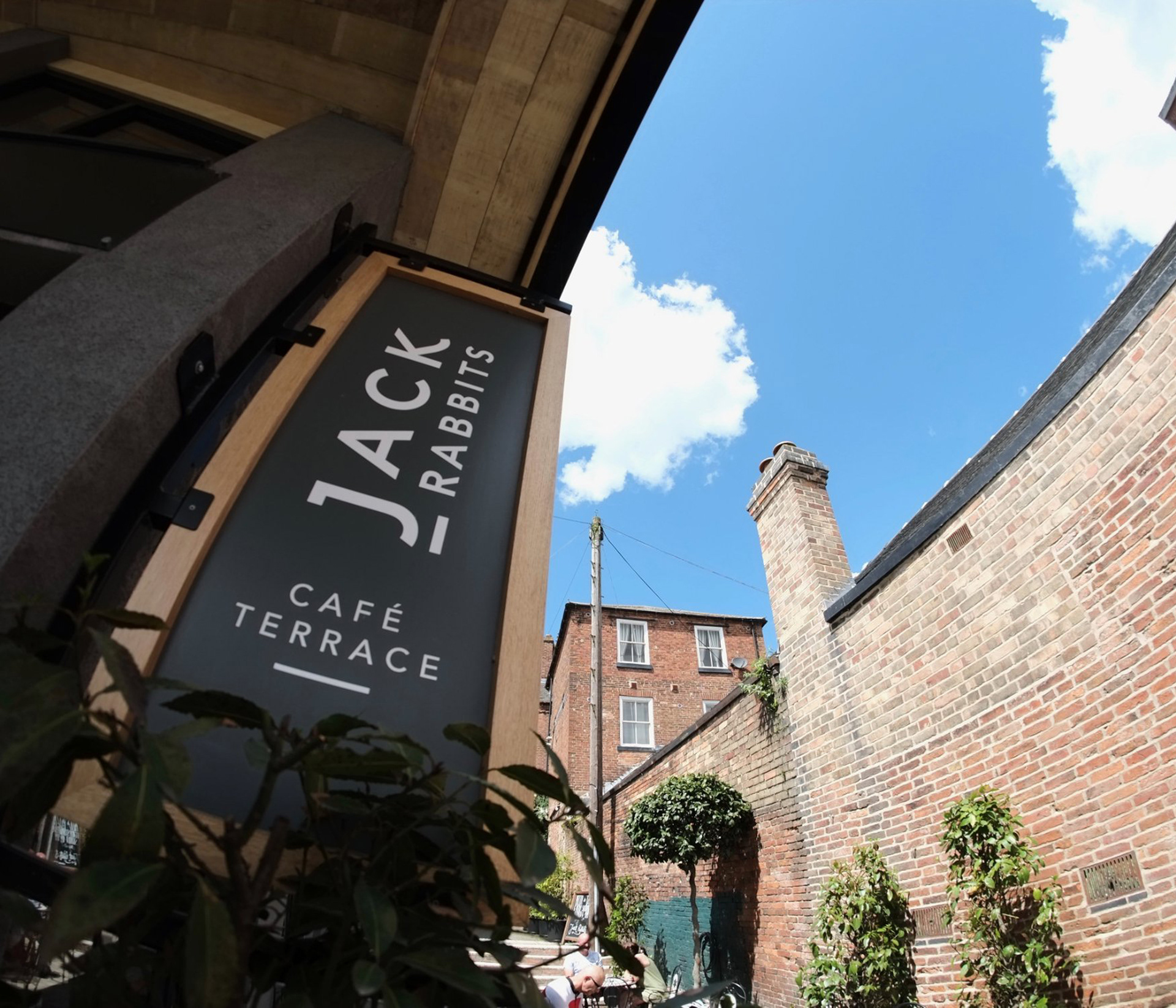
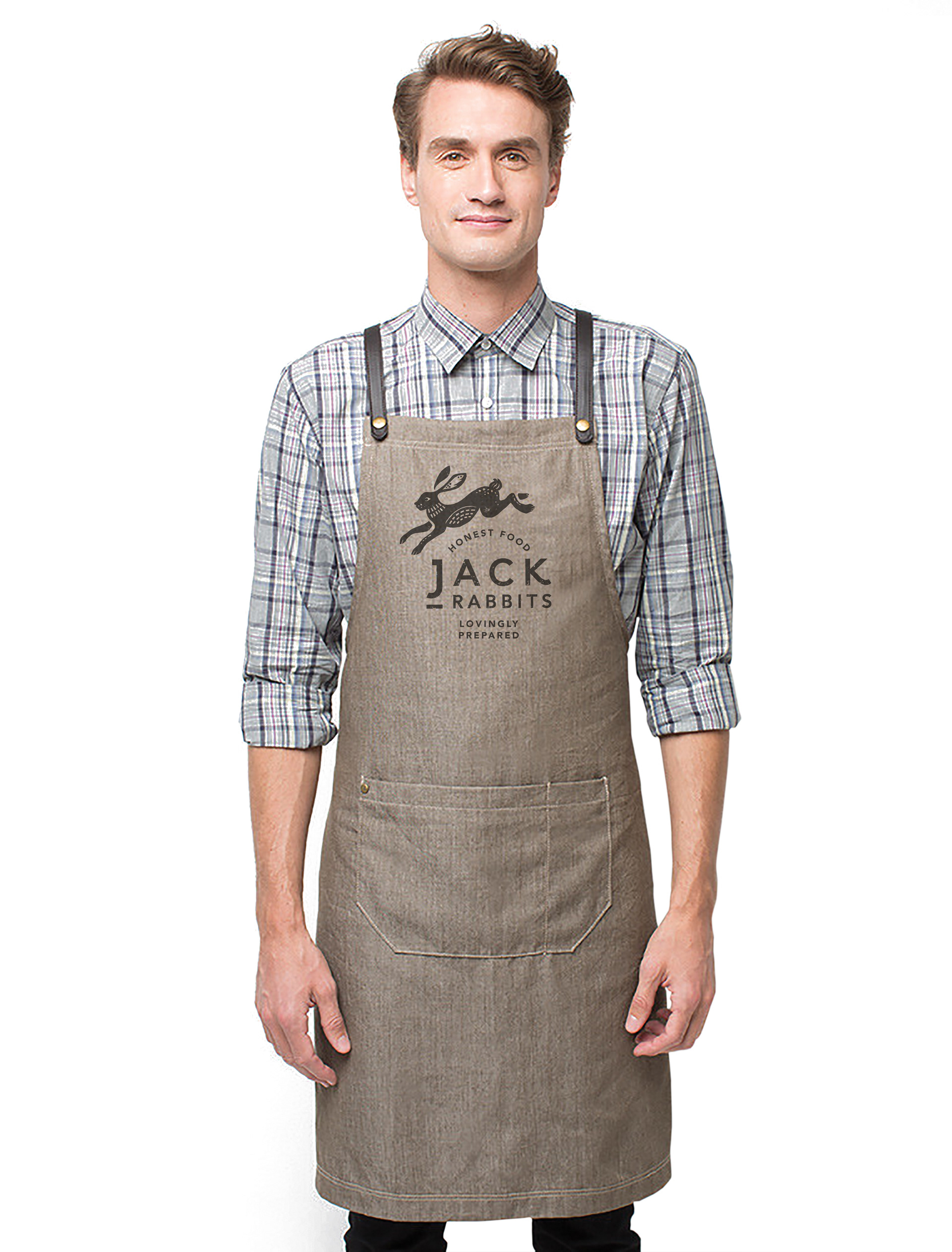
A rebrand for a much loved cafe in Derbyshire, Jack Rabbits serves honest food, locally sourced. With a new purpose built premises in the heart of Ashbourne, Firecatcher created a new identity which was applied across a range of customer touchpoints.
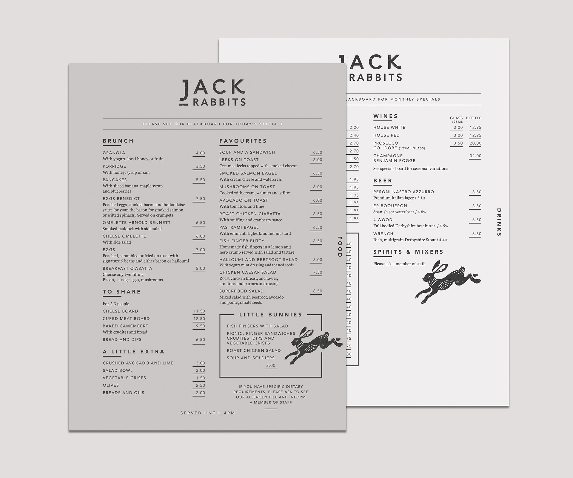
The symbol of the Jack Rabbit was created using a lino cutting technique and printed by hand, transmitting into the symbol associated feelings of quality, provenance and heritage; three of the core attributes of the brand, through its textured and stylised design.
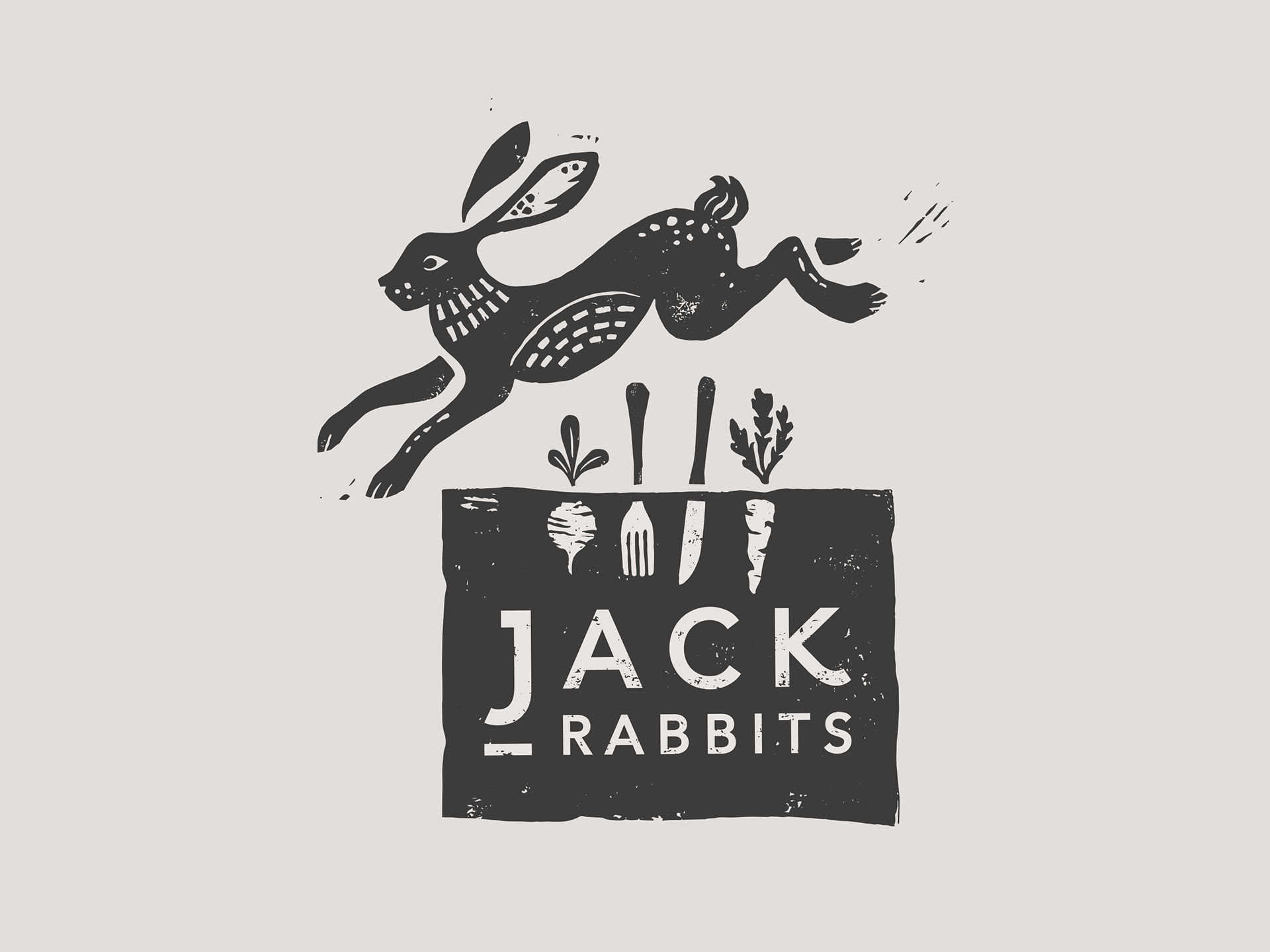
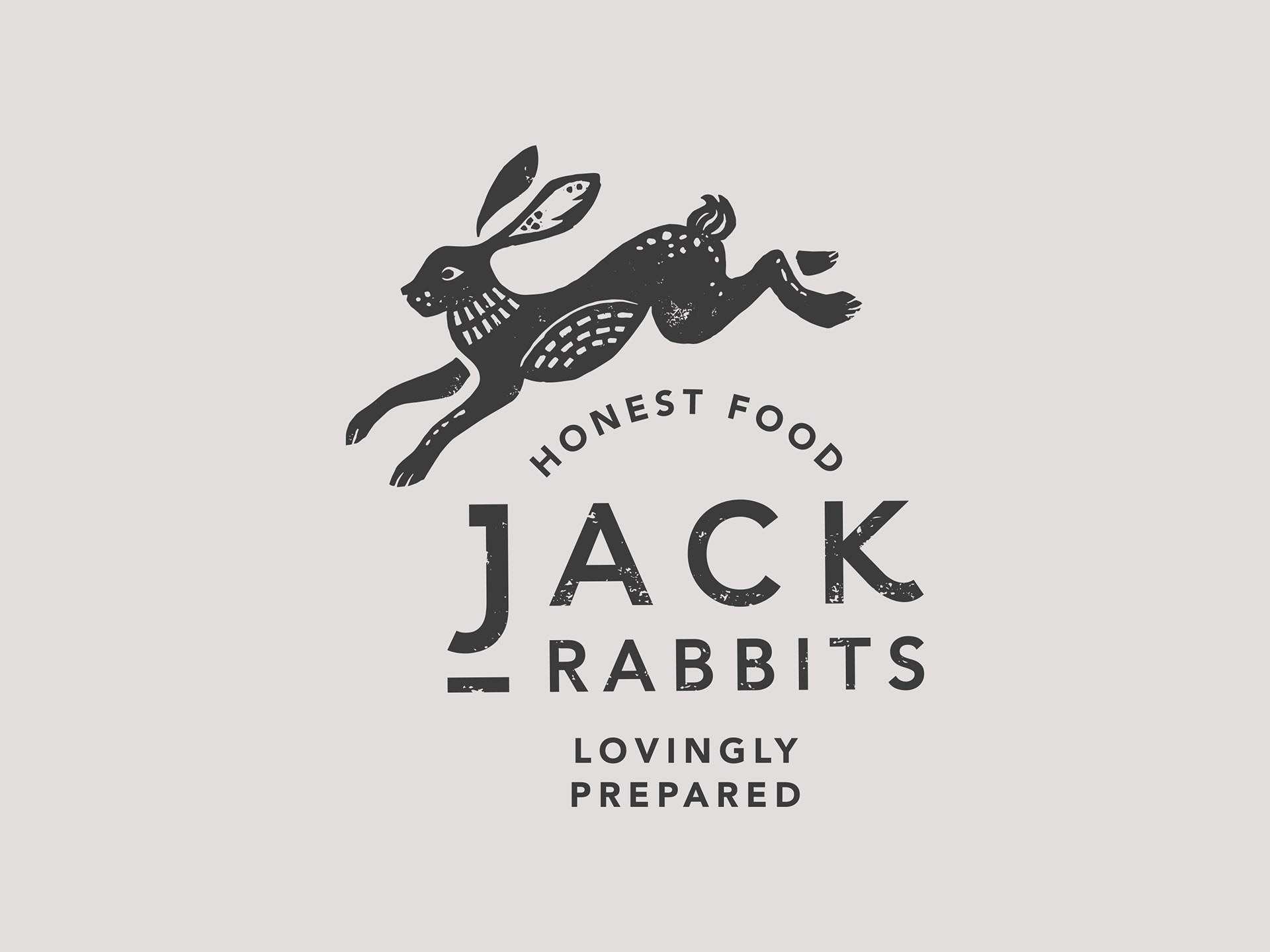
To provide flexibility, two versions of the logo were created. The first depicting the jack rabbit jumping over a vegetable patch, to illustrate just how fresh the customers can expect the Jack Rabbits produce to be. Injecting a playful tone we included a knife and fork shown alongside the vegetables as a very literal illustration of just how short the supply chain is from the hand picked suppliers to the customer’s knife and fork.
The second option for the logo is a refinement that allowed us to focus on the typography, giving it more presence within the symbol.
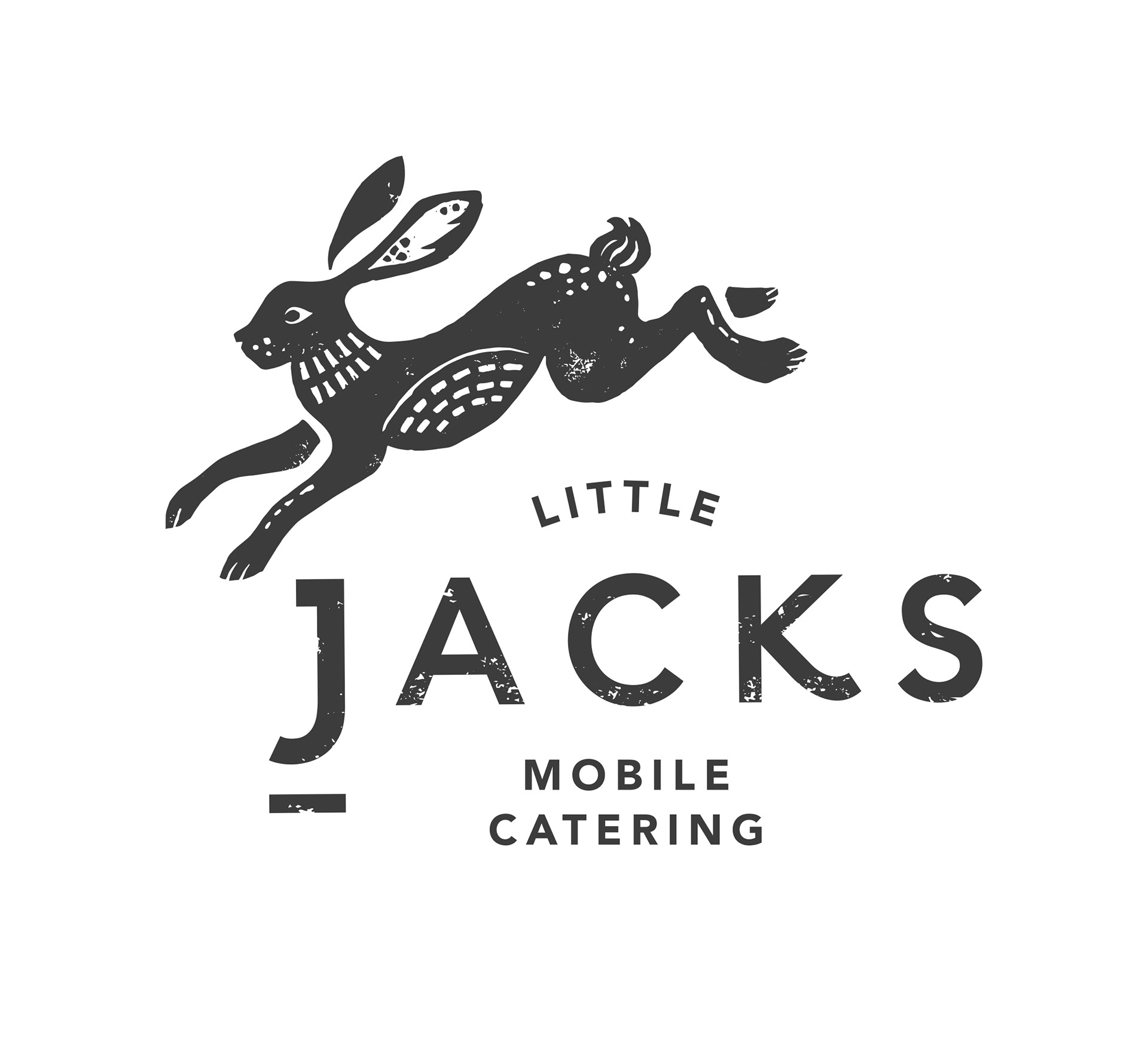
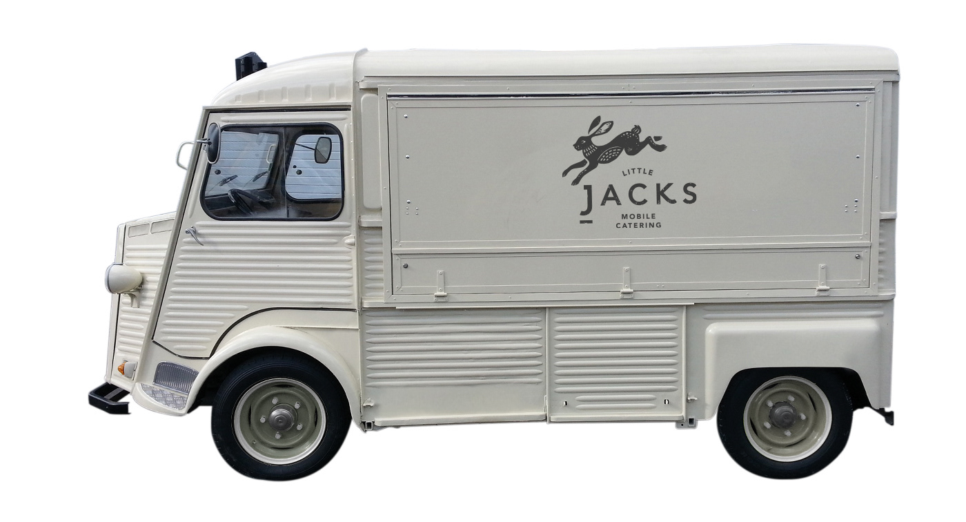
Evolution of the brand
The brand was designed with evolution in mind, allowing the logo to adapt as the business does, here shown through an adaptation of the core logo for ‘Little Jacks Mobile Catering’.