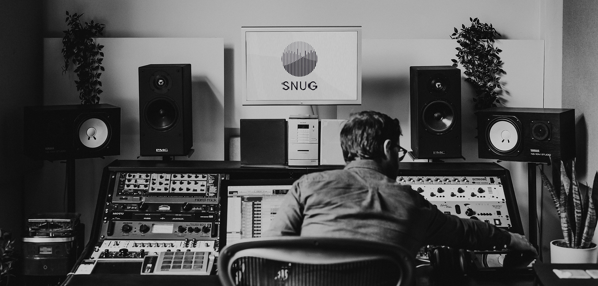
Shaping Sound
Rebrand for a music recording studio based in Nottingham. The identity articulates the passion, innovation and technical expertise of the company, with craft and creativity at it's heart.
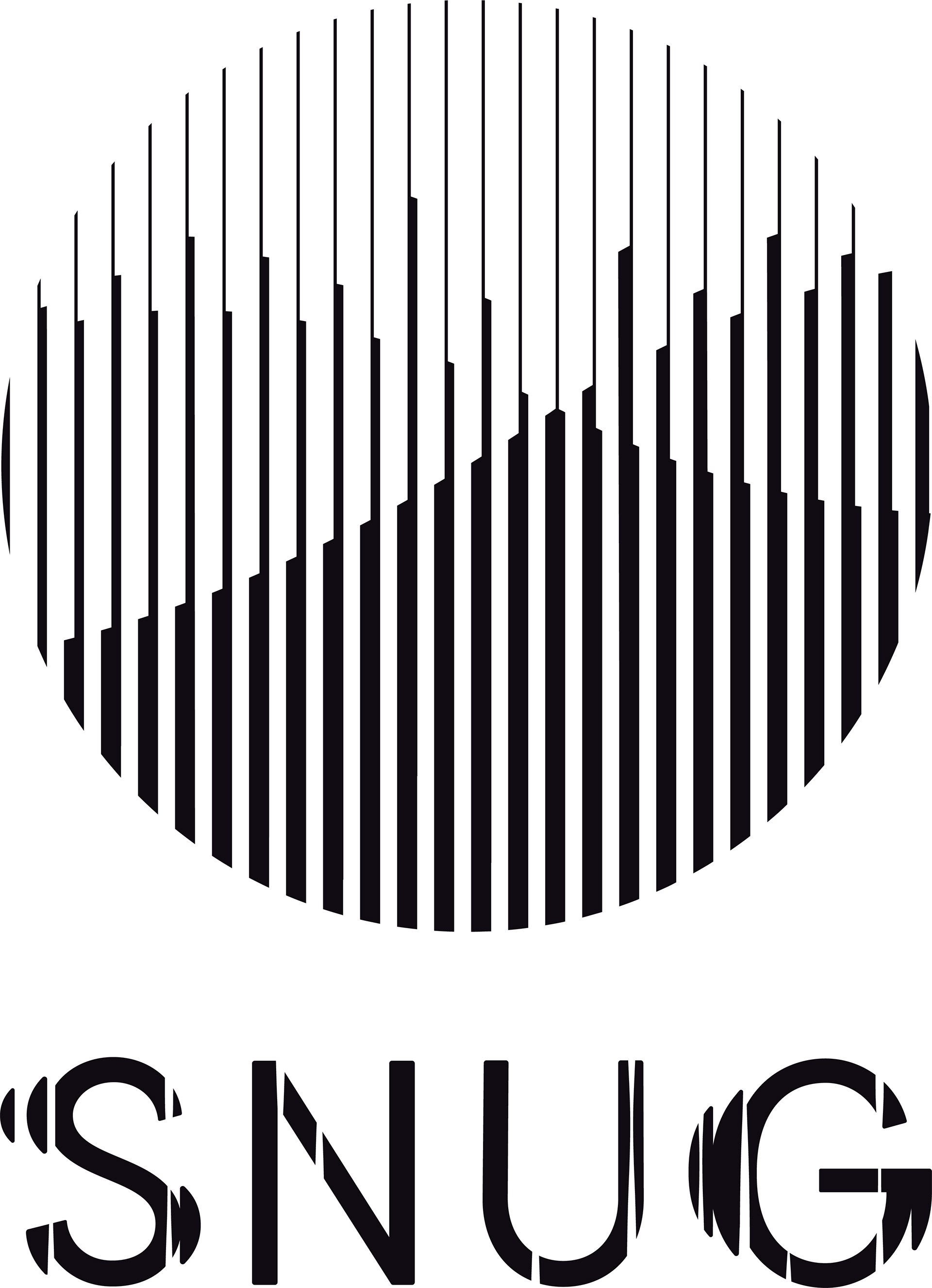
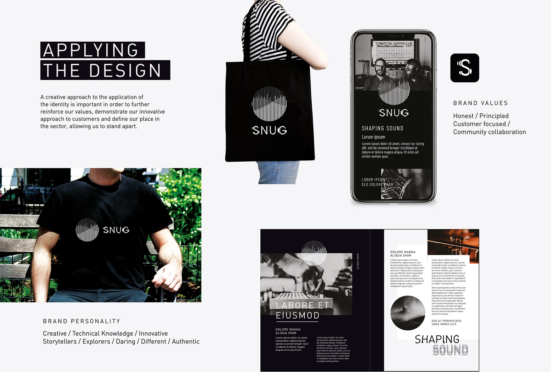
Depicting the shaping of sound, the Snug brand mark sees linear forms rise and fall, as fluid shapes cross, visualising the relationship between sound and image through pattern.
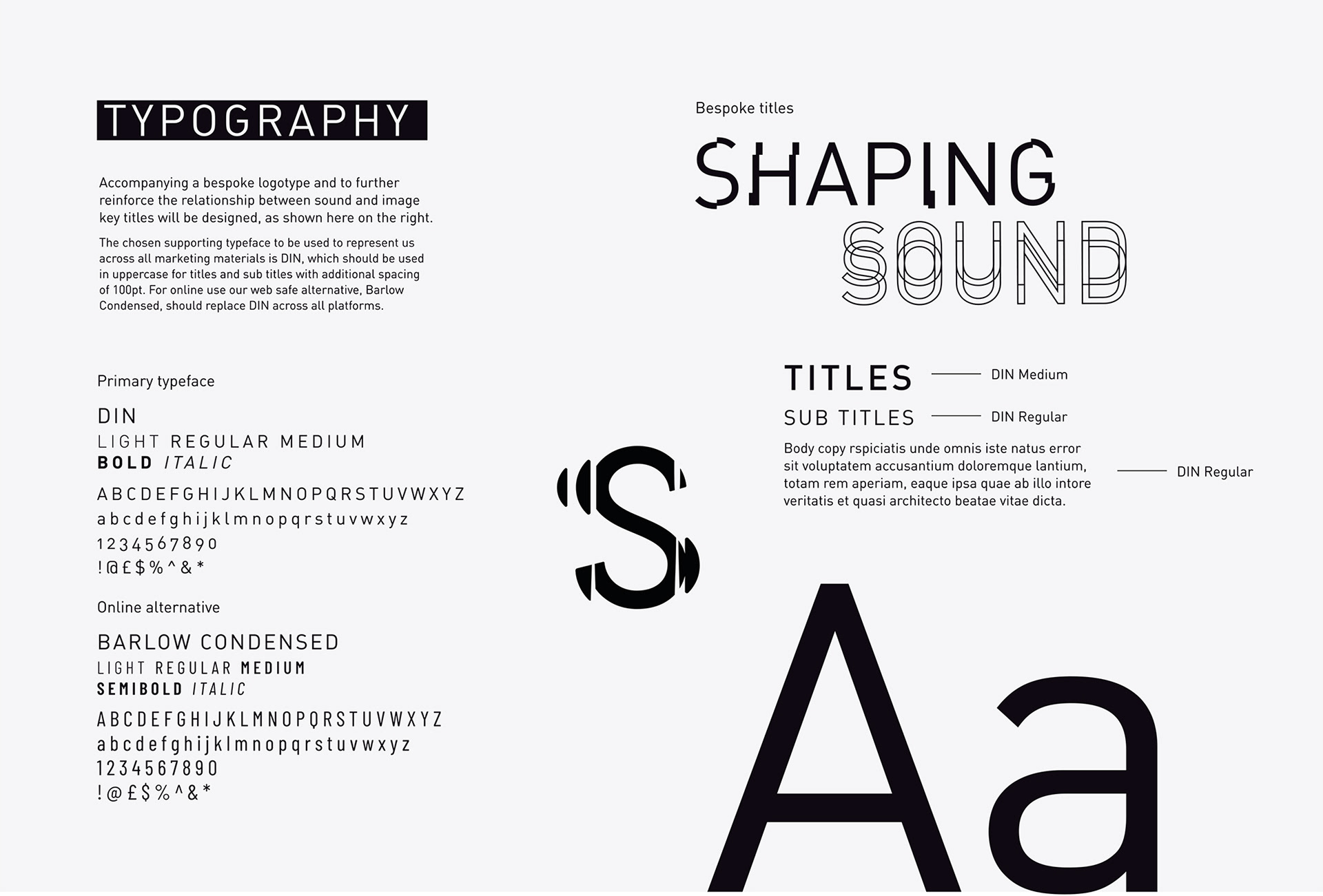
A bespoke logotype has been created, representing sound passing through the letterforms, refracting and pushing, changing their shape.
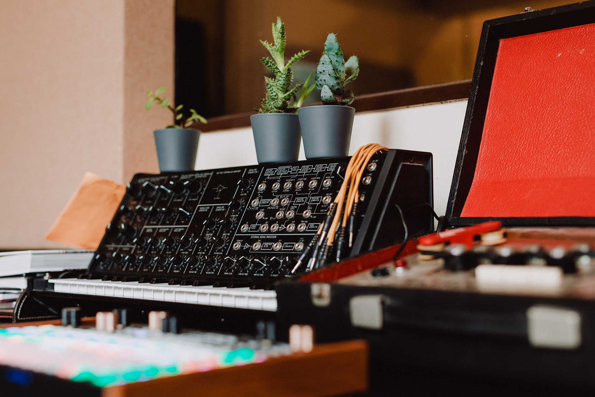
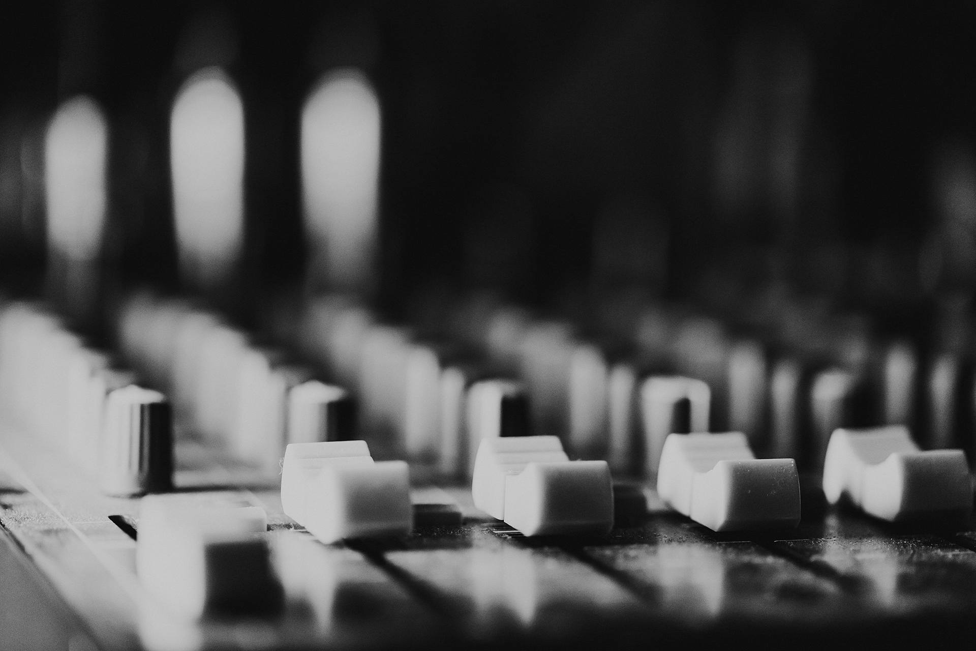
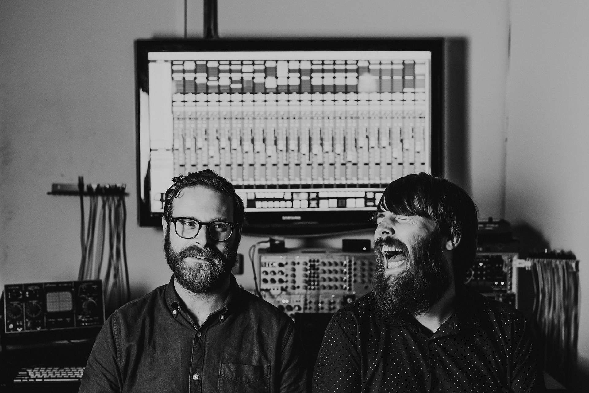
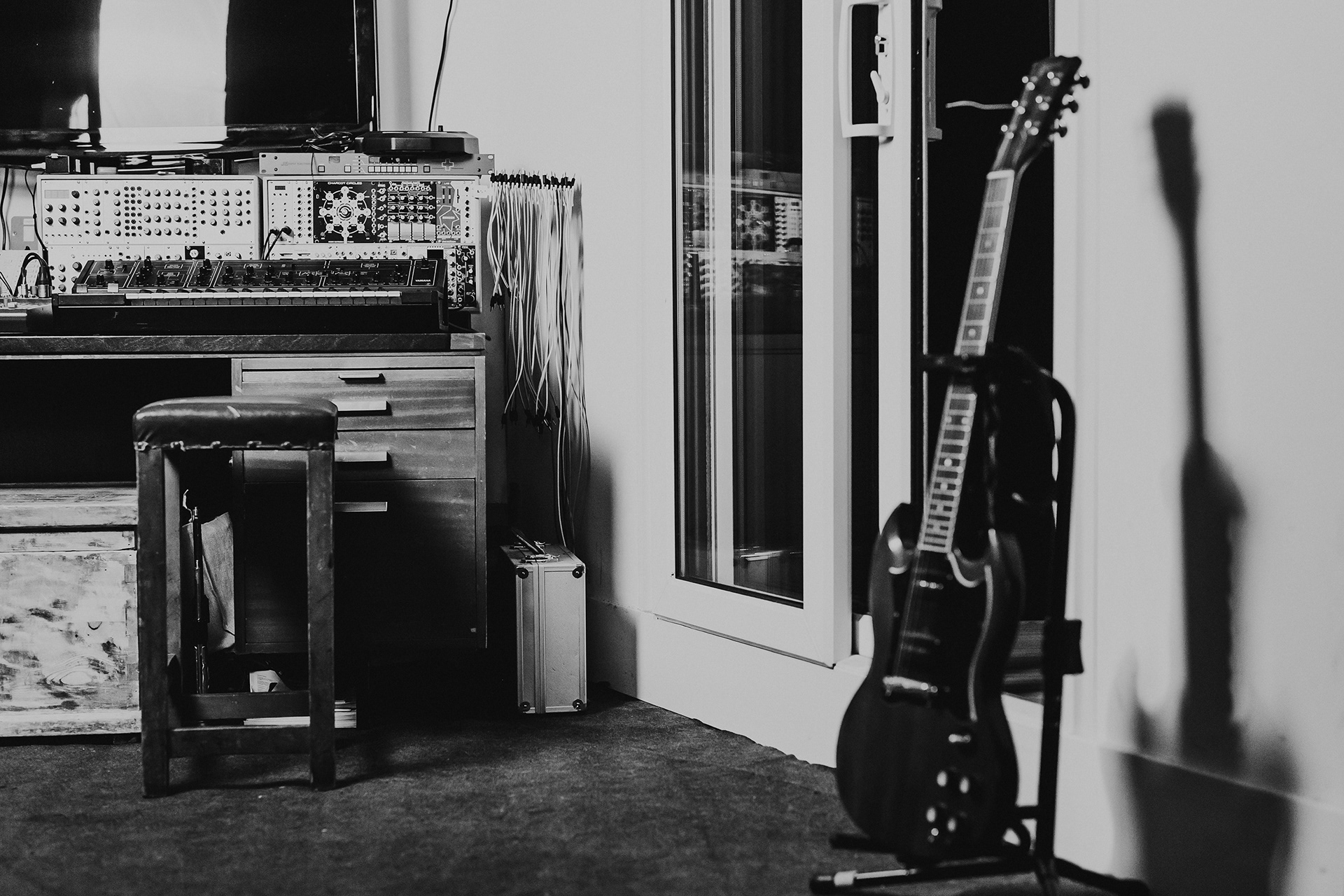
Photography by Elly Lucas